Mobile Interaction Designs
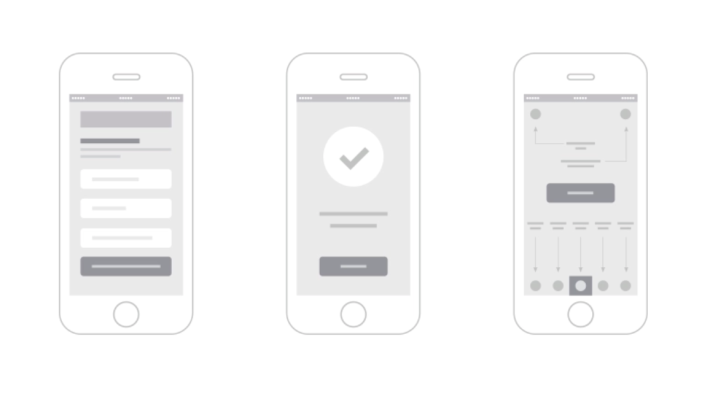
In this post, I’ll describe the essential aspects of effective mobile interactions and how to include all content in a short space without turning user interface into clutter. Filters Scrolling Searching Tabs


In this post, I’ll describe the essential aspects of effective mobile interactions and how to include all content in a short space without turning user interface into clutter. Filters Scrolling Searching Tabs
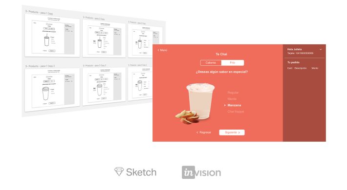
The main goal of this project was to design a better user interface for a self-ordering screen in order to improve the customer experience in the drive-thru service of Caffenio. I know every UX designer has their own formula for making design decisions, but I like to follow the next steps in projects like this. …
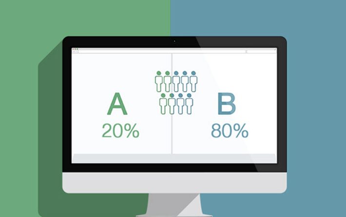
The main goal of this testing was to collect feedback from the target audience in order to determine which version of the Beroomers homepage performs better. This wasn’t an experiment using tools like Optimizely or Crazyegg where you can split the traffic of the site for showing two versions of a web page to the users and measure conversions or statistical …
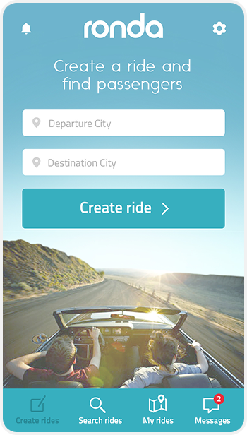
Ronda is a carpooling app where you can find & share rides with nearby people who want to save time, environment and money. This is the updated UI design for Ronda, behind every screenshot there is a deep user research and usability testing. Login screen We are using just Facebook connectivity because unlike other carpooling …
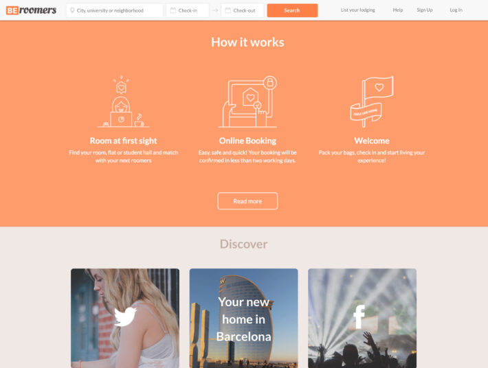
The following UI task is about improving the navigation of the Beroomers homepage. This is how the actual navigation works: If you noticed, when users are at the bottom of the site, they are forced to scroll up in order to find the navigation links again or complete tasks like search by city. What …