
Designing the UI for a self-ordering screen

The main goal of this project was to design a better user interface for a self-ordering screen in order to improve the customer experience in the drive-thru service of Caffenio.
I know every UX designer has their own formula for making design decisions, but I like to follow the next steps in projects like this.
Caffenio is a chain of coffee shops with more than 42 locations in México, and they have been facing a real problem in the drive-thru service. The waiting line is long and slow, and one of the main reasons is because the user interface of the self-ordering screen is not very efficient and the user spends too much time ordering. Customers leave when they see a lot of cars waiting in line.
The next step was to find insights and data that could help to design the right user interface.
Before understanding how customers use the self-ordering screen, I decided to go back to the beginning. I went to the older locations first, the ones with the speakers in the drive-thru service (not with the self-ordering screens) in order to understand how the customers were ordering their products.
Then I worked as a barista for a few days in the coffee stores with no drive-thru service (no ordering speakers and no self-ordering screens).
These two experiences provided me with personal insight into the ways customers placed their orders in a face to face interaction.
In a face to face interaction, the barista listens to every instruction from the customer in order to deliver exactly the product they want.
Lastly, I went to the coffee shops with self-ordering screens to observe how the customers were interacting with the actual UI and to detect which steps in the process were working smoothly and which were causing problems.
Then after organizing all my notes, I created an affinity diagram and a report with the top 10 pain points and I sent these to my team.
I had access to data about sales and products with more demand, but not about how customers provide instructions when they are customizing the product, and I believe that’s crucial research for designing better interactions between users and screens.
Performing a deep analysis of the 3 different contexts (face to face, speaker and self-ordering screen) helped me to write down the user stories and the user task flow.
User stories
I created user stories using the following structure:
As a <Who>, I want <What> so that <Why>
Example
As a Coffee Lover, I want my custom coffee made fast and easy so I can arrive at the office on time.
Personas
David
– He drives his car daily to the office for work.
– He is always in a hurry and appreciates things that save time.
– He is a coffee lover and prefers to customize his own beverage.
– Sometimes he doesn’t have time for breakfast so he wants a snack too.
All the previous research was really useful for creating user task flows based on individual interactions.
After creating the new user task flow I compared it with the actual flow in order to analyze how well the modeled flows meet the needs of the targeted users, as well as the business goals.
During this part of the process, I included my team to analyze and discuss potential improvements.
After defining every user task flow I started creating the wireframes of the user interface in order to define the navigation, interactions, and layouts that outline the specific size and placement of elements.
Once I finished with the wireframes I created prototypes using Sketch and Invision.
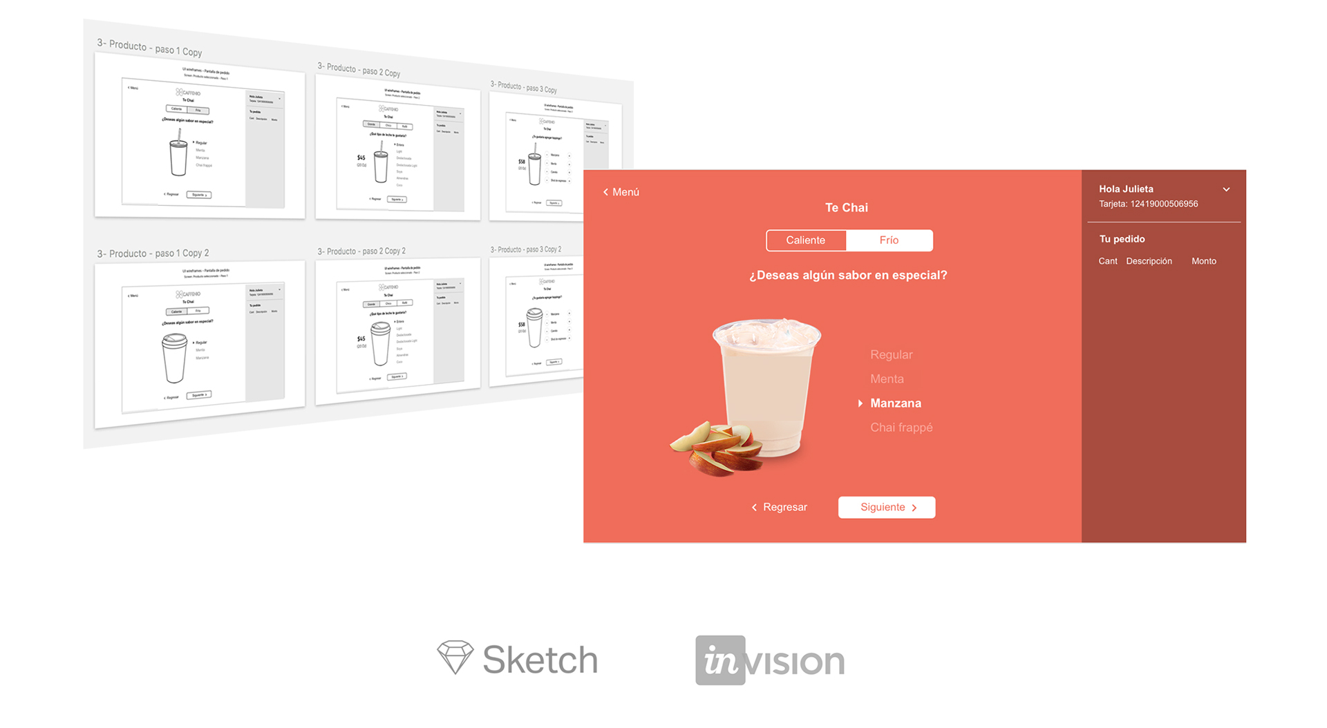
The ultimate goal of effective prototyping is to validate the design more efficiently than with the production code.
In this part of the process, we tested these prototypes with real customers in order to evaluate the user interface design.
We tested both user interfaces, the current design vs the new design with 50 frequent consumers and 50 new coffee lovers.
These were the questions for screening the 50 participants not familiar with the brand:
1- Do you like coffee or any of the following products?
2- Do you use drive-thru services for ordering coffee or food?
These were the key indicators to evaluate during user testing:
Business goals
1- Which version of the UI speeds up the ordering process in the drive-thru service?
2- Which version of the UI encourages the user to buy more products?
User needs
1- In which version of the UI is it faster to order a product?
2- In which version of the UI is it easier to customize a product?
3- In which version of the UI is the user more attracted to the product?
Conclusion
37/50 frequent consumers said that it was easier for them to order a product with the new UI design.
42/50 frequent consumers said that it was faster for them to order a product with the new UI design.
48/50 frequent consumers said that they felt more attracted to the image of the product on the new UI design.
34/50 new consumers said that it was easier for them to order a product with the new UI design.
44/50 new consumers said that it was faster for them to order a product with the new UI design.
50/50 new consumers said that they felt more attracted to the image of the product on the new UI design.