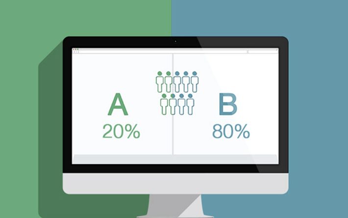
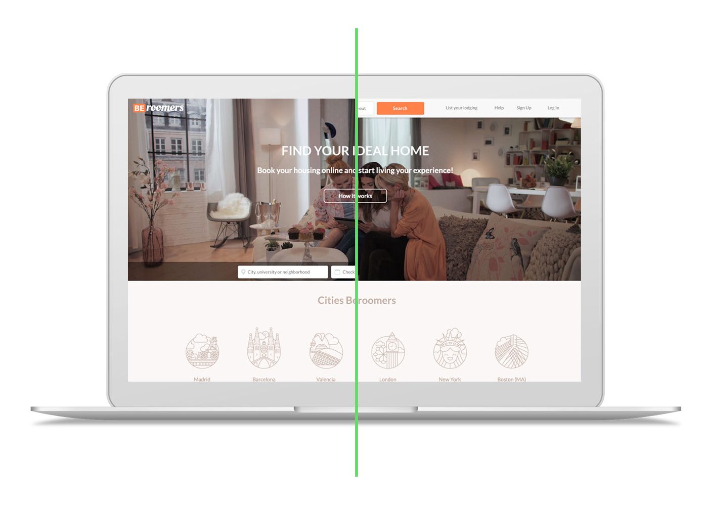
This is not a conventional A/B Testing

The main goal of this testing was to collect feedback from the target audience in order to determine which version of the Beroomers homepage performs better.
This wasn’t an experiment using tools like Optimizely or Crazyegg where you can split the traffic of the site for showing two versions of a web page to the users and measure conversions or statistical analysis.

This was a face to face exercise with 18 participants that revealed different reactions, such as facial gestures, even positive or negative comments, when they were using the prototype.
The procedure was really simple, I asked each user to complete the following task:
1- Enter to version A of the homepage.
2- Find and read the “What they say about us” section.
3- Search for housing in Valencia, Spain.
4- Select a check-in/check-out date.
5- Click on the “Search” button to see the results.
Now we are going to do the same on version B:
1- Enter to version B of the homepage.
2- Find and read the “What they say about us” section.
3- Search for housing in Valencia, Spain.
4- Select a check-in/check-out date.
5- Click on the “Search” button to see the results.Please let me know which version of the homepage was easier for you to achieve the task.
Thanks for your help.
Each participant voted A or B after completing the same task in both versions.

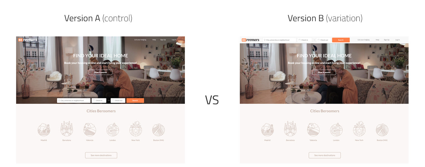
This was the version A (control version) of the homepage:
https://invis.io/K69WJRH2G
This was the version B (variation) of the homepage:
https://invis.io/JC9WZF6YH
* These prototypes were created only for desktop/laptop resolutions.
Results
These A/B versions of the homepage were tested by 18 users.

4 of 18 users selected version A as the easiest way to achieve the task.
14 of 18 users selected version B as the easiest way to achieve the task.
Conclusion
After analyzing the results, we can assure that using a fixed search bar with the calendar feature at the top of the screen is an improvement that is worth launching because users aren’t forced to scroll to complete the task.
Every interaction matters and becomes part of the user experience, even small details like a sticky header can remove unnecessary efforts like scrolling to find the search bar again.
Tools
I used Sketch for designing the screens and Invision for creating the prototypes.
