Every interaction matters

Let’s do a quick analysis of this navigation bar.
After scrolling down you can see how the title of the post is replacing the navigation links on the navbar.
This micro-interaction maybe can:
– Reduce distractions on the screen.
– Keep the user focusing on the post.
– Optimize space on the screen.
But there is a drawback to this. When you are at the bottom of a long post and you want to see the navigation links again you have to scroll all the way up to the top.

Suggested solution
I think the performance of this navbar could be more effective if we just modify the micro-interaction like this:
If the user scrolls down the bar will display the title of the post.
If the user scrolls up the bar will display the navigation links.
This way the users can focus on the post and also they can easily get back to the navigation links. After all, navigation links should always be easy to find.
Example
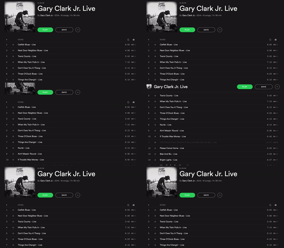
When you open an album on Spotify, after scrolling down, the height of the header decreases with a smooth transition keeping the title and the buttons on the bar.

Resizing the header this way is very useful because:
– You have more space on the screen to explore the tracklist.
– The name of the album and the buttons are always visible.
Conclusion
Improving user experience is not only about adding delightful micro-interactions, but it’s also about removing or minimizing unnecessary efforts.
