

Navigation
The following UI task is about improving the navigation of the Beroomers homepage.
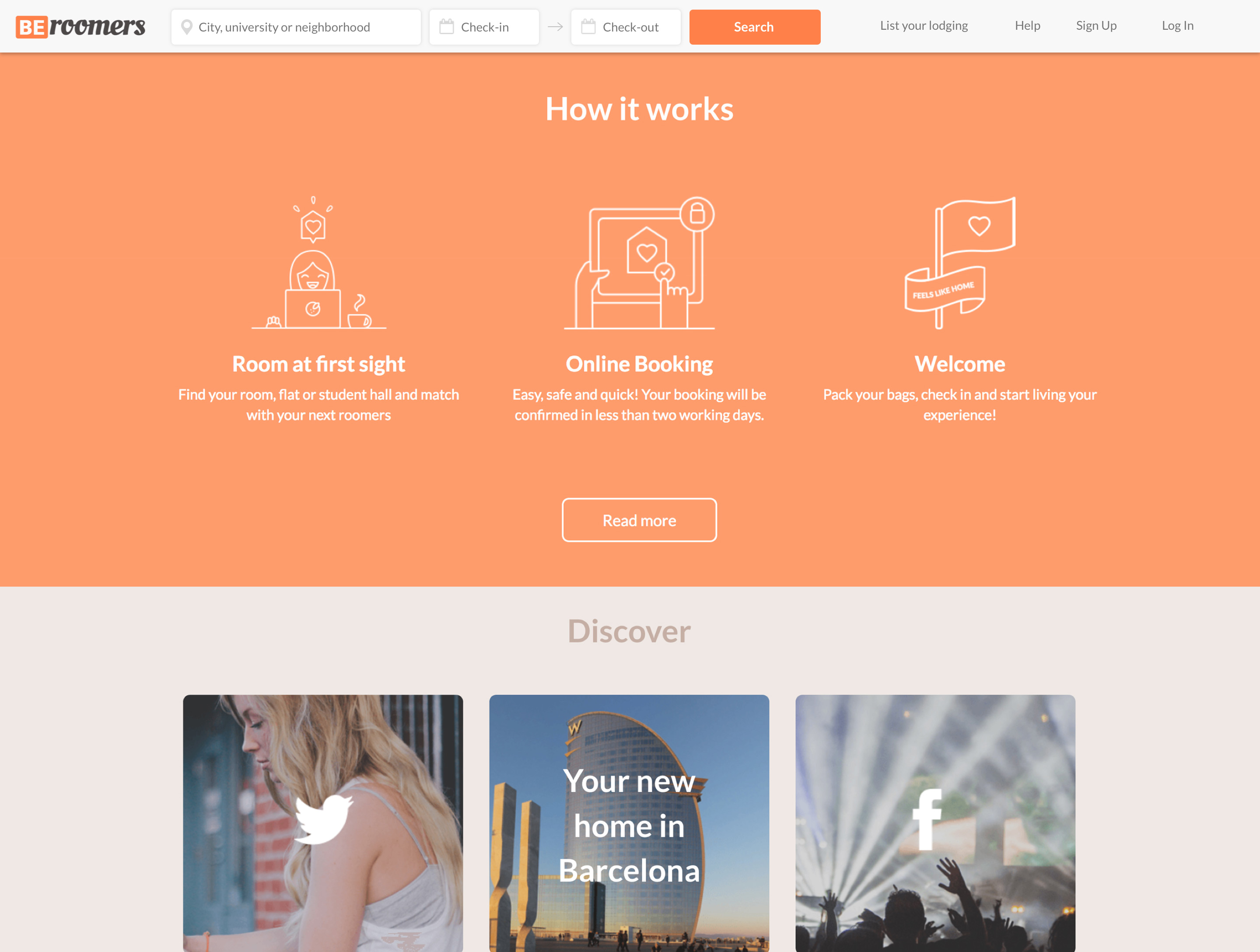
This is how the actual navigation works:
If you noticed, when users are at the bottom of the site, they are forced to scroll up in order to find the navigation links again or complete tasks like search by city.
What could the UI do to prevent this from being a little issue?
One idea is merge the main navigation links with the search and date fields in one single fixed nav bar.
And the perfect timing for showing this new nav bar is after scrolling down at the end of the hero image.
I created this quick prototype in order to explain the idea of the animated transition.
Preview:
The goal of this new navigation design is encourage users to achieve their tasks with a minimal effort when they are scrolling down and exploring the site.
Sometimes users don’t make a decision until they read a review of the product or service, and in this case the testimonials are at the bottom of the homepage.
Keeping the navigation and the search field always visible on the top of the screen helps users to achieves tasks more quickly when they are ready.
Like Steve Krug says:
“Once users think they know what to do, they immediately stop scanning and do it.”
Also, we can include a subtle effect on the SVG icons of the text fields like this:
That’s the kind of details that keeps users oriented after filling a text field, showing visually feedback in a smooth and natural way.
These little visual effects communicate what is happening without breaking users’ flow.
Conclusion
Design is driven by decision making, and we are making those decisions on behalf of our target users, not ourselves.
But to make decisions, we must have options to choose from.
That’s why I conducted a user-based evaluation of this new design vs the previous one, where actual target users performed realistic tasks to determine if they can complete them successfully.